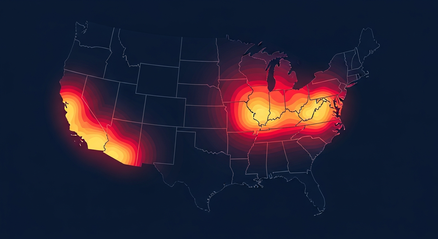
A crime heat map of the USA takes millions of individual incidents and turns them into an instantly understandable picture. Instead of reading tables of numbers, you see color intensity — bright, hot zones where crime concentrates and cooler areas where it is sparse.
How a Crime Heat Map Works
Heat maps use color gradients to represent density. Areas with many reported incidents glow red or orange; areas with few appear blue or green. The result is a visual summary that reveals patterns invisible in raw data — regional clusters, urban hotspots, and safe corridors.
What a National Heat Map Reveals
- Urban concentration: Crime tends to cluster in dense metro areas.
- Regional patterns: Some regions show consistently higher rates than others.
- Hotspot identification: Specific cities and corridors stand out clearly.
- Comparison at a glance: Compare entire regions without reading a single number.
From the Big Picture to Your Street
A national heat map is a starting point for understanding broad patterns, but safety decisions happen locally. After you spot a region of interest, zoom in with a neighborhood crime map and review crime trends by city to understand the detail behind the colors.
Interpreting Heat Maps Responsibly
Remember that heat intensity reflects reported incidents and population density. Dense cities will always show more activity simply because more people live there. Always pair a heat map with per-capita local crime statistics for an accurate read.
Stay Informed. Stay Safe.
Crime Stop gives you real-time crime reports, interactive maps, and safety alerts for over 100 US cities. Join your community today.
Explore the Crime Map